Ever wondered why certain support or resistance levels stick like a charm, yet other times seem to completely fail?
Ever been unsure if you are actually using the correct levels where the major players are parked?
If you’ve ever had this experience, you are not alone. I had this for years before I figured out this trick which explained why these key levels don’t work the way you think they should.
In today’s article, which is Part 1 (of 3) in a series, I’m going to go over why support and resistance levels don’t work the way you think they should, and how you can find levels based on institutional positioning.
Past History vs Present Positioning
Take a look at the following chart below which shows several support and resistance levels on the S&P 500 ($SPY chart from April 2 – April 14).
$SPY 1hr Chart
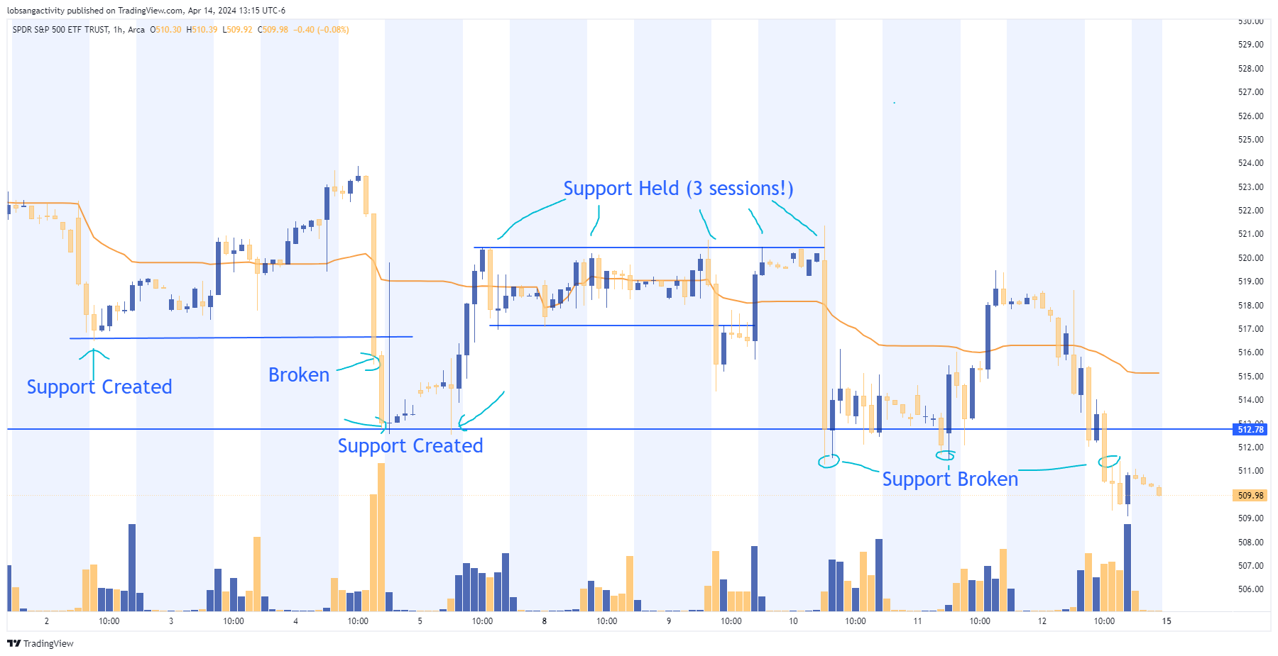
As you can see above, as the market corrected lower, the majority of levels that were formed (via the price action) broke within 1-3 sessions. Only one held consistently as was never broken during this entire period.
This can be frustrating for you traders who currently use charts and technical analysis, because you’ll draw your levels, expect them to hold, and yet…they fold! 😥
The problem lies in the belief behind support and resistance levels and looking for them purely in the charts.
This is because they are based on the past history of price action and how it unfolded over time.
Now you may be thinking “if price respected this level before, isn’t it fair to assume it will respect it again?”
This is a natural assumption, but the problem is its only based on the past price action. It is not based upon current positioning.
You see, the levels you draw in the past only ‘infers’ it will hold in the future. But what actually determines whether that level will hold (or fold) is if a) there is enough positioning around that level to defend it, and b) there is supportive order flow coming in around that level (if needed).
Thus, the levels you draw on the chart are necessary, but insufficient by themselves. They do not tell us where the major players are parked today.
What does?
Open interest! ⚡
As option traders, in your brokers platform, you get access to (at least) two types of order flow and positioning. They are:
- Volume (how many contracts are being traded at what strike, expiry and stock/ticker)
- Open interest (unsettled contracts that are open at the start of the day)
Now if you’re wondering “how does this help me find institutional positioning and at what key support/resistance levels?”, the answer lies in the open interest. 💡
We can use open interest to see exactly where the largest players are stacking their positions.
A Demonstration 👨🏫
Looking at the option chain below for $SPY, we can see for the APR op-ex (April option expiry) exactly where (what prices) the largest amount of calls and puts are parked.
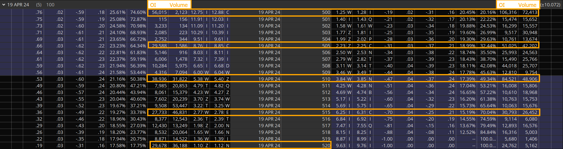
Using the chain above, the left side of the chain represents the calls, and the right side shows the puts. I have denoted which vertical columns are the open interest (OI) and how much volume was traded on the day (volume) for both calls/puts.
The strikes/prices above with the most amount of option contracts are (from top to bottom in terms of OI):
- 500 (~128K contracts for calls/puts)
- 510 (~87K contracts for calls/puts
- 505 (~77.5K contracts for calls/puts)
- 515 (~53K contracts for calls/puts)
Thus, for this April’s option expiry on the 19th, we can see which prices have the largest amount of contracts. This is ‘current positioning’, hence, not something from the past, but for us traders right now. 💡
And if it changes the next day, we’ll see exactly by how much. Thus, we can determine if the level is becoming stronger 💪 or becoming weaker 👎🏻.
But wait…there’s more! 😮
For example, we can figure out what targets the bulls are gunning for (515, 520) along with which levels the bears are aiming at (505, 500). On top of this, we can find where the balance of positioning shifts between calls and puts (510).
Those three insights above give us bull targets (if we’re bullish), bear targets (if we’re bearish) and at what prices $SPY becomes more vulnerable (< 510) or more stable (> 510).
This last point is important because if calls are in control, volatility is likely to be < and dips more likely to be bought. If puts are in control, then volatility is likely to > and $SPY more vulnerable to declines.
This approach to support and resistance is 10x more effective than drawing simple levels on the charts.
It is only when we look at the option chain can we actually ‘know’ where the largest amount of positioning is and how positioning changes over time.
Now Your Turn 👉
Before you look at your brokers option chain, go pick 2-3 major tech or semi-conductor stocks and draw your levels on the charts which you think are most important.
Then go to the option chain in each of those tickers for this April’s option expiry, and see where the big players are actually parked. 🤔
My guess is you’ll find the levels you drew on your chart were not totally accurate (all the time). By learning to read the option chain and find the current positioning, you can isolate key levels that are more likely to hold, giving you better levels to enter and exit from.
NOTE: these are just some of the things you can discover by learning to read the option chain. As you build your skills and learn new strategies, you’ll find better way more precise entries and exits.
Part 2 of this series will come out in a few weeks, so use this time to practice this new method, and let me know how it goes.