In this article, we are going to talk about the traditional definition of price action, how we approach it differently than others, and how you can use price action to trade pretty much any asset class and any time frame
What is Price Action Trading?
In the most traditional and technical sense, price action is simply price’s movement over time. This could be on any time, ranging from the 1-minute chart, all the way up to the monthly chart. Any price change or fluctuation for any instrument is a form of price action. Price action trading is the science and art of trading these price fluctuations over time with few or no indicators. By learning to read price action and price’s movement over time, you can learn to:
- See where the institutional players are getting involved
- Where key support and resistance areas are located
- Where to find precise entry and exit locations
- When to get out of a trade, add on to a trade or exit for profit
- How to trade transitions and reversals
- How to spot breakouts and identify if they have a high probability of working out or not
- Get into trends early on
- Identify the overall market conditions and how to position yourself based on that
This is why learning to read price action can (and in our opinion should) be a critical component of one’s trading. However, based on one’s approach to it, there are key differences in how one can trade it.
Various Ways to Approach Price Action
A lot of price action trading techniques you find on the internet these days are based upon candlestick patterns. Some of these patterns can be flags, triangles, double tops and bottoms, pinbars, inside bars, etc.
But if you are trading these patterns just because they are a pattern, then you are really failing to understand what price action is. As already mentioned, the proximate driver of price action is order flow which is the total sum of all buy and sell orders that are executed in the market.
It does not matter whether the market is moving because of a fundamental or technical reason. Order flow is the underlying force and reason why price moves on the chart. Price action has the fingerprints of order flow all over it.
Some markets do offer tools that allow you to read the order flow directly, for example via the DOM (depth of market) or time & sales (T&S) in the stock market. Markets such as the FX market, a market that isn’t centralized, does not offer the same advantage.
Regardless, since the most common driver of market movements comes from order flow, you can learn to read the order flow distribution using price action.
Don’t get me wrong, we also do trade patterns in the markets, such as breakouts for example, but we do so with the key understanding that all price action is the result of order flow. And since order flow is what moves the markets, we have to learn how to read order flow through price action. This is how you can take your trading to the next level.
Good Trading Decisions Are Based Upon Context
If you want to find high probability trades and skip those with a low probability of working out, you’ll need to develop a core skill.
What is this skill you ask?
The core skill we’re referring to is the ability to read the ‘Price Action Context’.
Yes, Price Action Context.
First, in order to make things easier, let’s define the word ‘context’. Context refers to the ability of understanding and approaching a situation based upon the ‘context’ (or environmental variables) around it.
In price action, the ‘context’ is a way of describing the overall environment, and using that to help you trade with the underlying order flow.
Now, before we dive further into how you can analyze the price action context of an instrument, let’s go over the basics of technical analysis as this is a crucial precursor to understanding and being able to read charts properly.
Introduction to Technical Analysis
Okay, so what is technical analysis?
Technical analysis can simply be defined as using technical methods to analyze a stock and use information in a chart to predict what is the more probable direction for the stock in the future. Typically, this is done with a price chart.
While there are many types of charts, the most common and our preferred method is the candlestick chart, which you can see below.
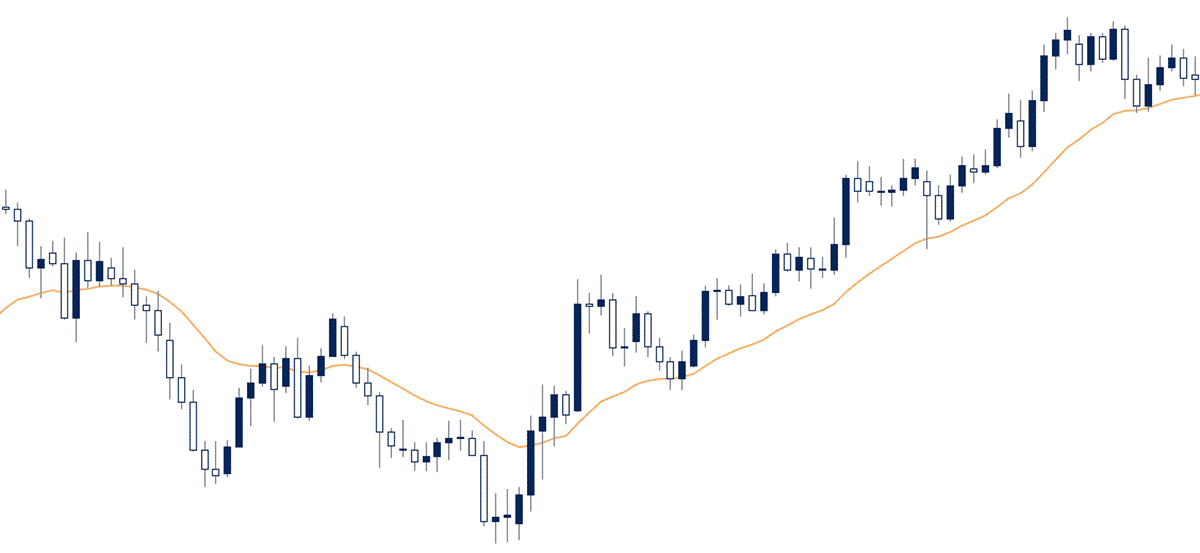
Those blue and white bars that you see in the chart are called candlesticks or candles. They move up or down based on changes in the price, they have different shapes, with little wicks or lines on the top or bottom.
Each one of these bars/candles represents the stock’s movement for a particular amount of time. For now, we’re going to focus on the very basics of technical analysis, starting with candlesticks.
Before you can really understand a candlestick chart, you must understand what candlesticks represent. To break down candlesticks a little bit further, we’re going to show you a bullish and bearish candle individually and explain what they mean about the stock’s price so you can understand how they work.
NOTE: You can color your candles any colors you want, but typically in most charts, by default, they are going to be green and red.
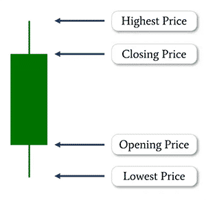
This green candle above represents a bullish move for the instrument, and we’ll be showing you a red one shortly that represents a bearish move.
Let’s say this candle is from a daily chart. That means each candle, like the one above, that you see on the price chart equals the stock price’s movement over that entire day. Thus, this green candle represents a bullish day, meaning the stock traded higher for that day.
There are a couple main parts of the candle that you need to understand, which is the body (the ‘boxy’ part of the candle), and then there’s the wicks or little lines at the top and bottom.
The body of the candle will represent the open and the close of the stock price for that day. Since it went up, the bottom part of the candle’s body is called the opening price while the top part is the close. The wicks on top and the bottom represent the highs and lows of that candle or the highest and lowest price of the stock for that particular day.
If you look at this candle and you want to understand what it really means in terms of that stock price, it basically means the stock opened at the bottom of the candle’s body, traded a little bit lower, and at some point in the day, bounced higher, hit the highest price at the top of the wick, and then closed just a little bit off the highs.
Moving over to this red candle, it’s basically the opposite of a bullish candle. Since it is a red candle, we know that it’s a bearish candle, that means the stock price went down for the day.
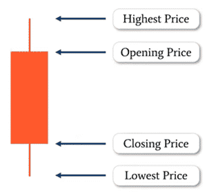
Essentially this means this instrument opened at the top of the candlestick’s body, went a little bit higher which is represented by the wick at the top, and then some point in the day, it sold off, went all the way down to the bottom of that wick, and then bounced a little bit and closed a little bit off the lows.
These are the four components, the ‘boxy’ part is the body (price movement between the open & close), and the lines on the top are those of the wicks (price movement between the highs & lows of that time compression).
The top wick will always represent the highest price of the day, and the bottom of the wick pointing downward will always represent the lowest price for that day. That means the bottom of the body is the opening price and the top is the closing price.
For a bearish candle it is just vice versa. The opening price is the top of the body, and the closing price is the low of the body. This is how to read candlesticks.
While it may seem confusing right now, with some practice it will become second nature very soon. Eventually, after looking at enough candles, and soon it’ll just be automatic in your head, you’ll understand it without any sort of thinking.
On the price action charts that we looked at earlier, you can see that candlesticks take many shapes and forms. Don’t be intimidated by this. As soon as you start looking at a bunch of charts, this will become second nature. It won’t be that complicated to read at all.
Okay, now going a little bit deeper into technical analysis and chart reading, there are three main environments in terms of price action:
- Downtrends
- Sideways movement (also called ‘ranges)
- Uptrends
These are the only three things that you can really see on any particular chart.
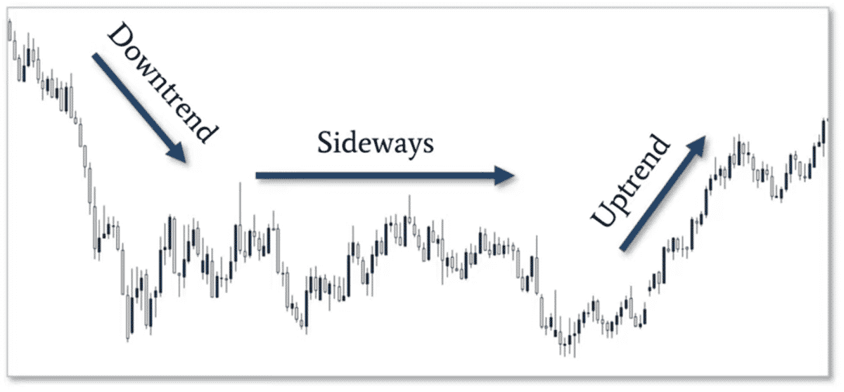
Downtrend is very straightforward. That’s when the price of that stock is trending downward over time. A sideways, or what we call ranging market, is when the price is going sideways or stuck, not really going up too high or not really going down too low. It’s stuck between a few prices. An uptrend, simply the opposite of a downtrend. It’s the price of a stock appreciating consistently over time. These are the only three technical environments you can be in at any given time.
Trends, as we mentioned before, downtrends and uptrends, these are just directional moves where the instrument is either being bought up or sold consistently.
NOTE: For those of you wondering about the bull and the bear symbolism, it has to do with how those animals attack. A bull, with its horns, will attack from down to up. It’s attacking upward, hence a bull trend. A bear will attack with its claws swiping down, hence a bear trend. That’s where that terminology comes from.
Now let’s dive a little bit deeper into trends. Even though trends can have an overall upward or downward direction, they can also have what we call swings in the market, where the market swings up or down inside the overall trend.
When you look at the chart below, you see that the overall price is climbing over time, but there are individual pullbacks within that bullish trend. You can see that price is making new higher highs on each move up and new higher lows on pullbacks. These little upward swings are called trend swings.
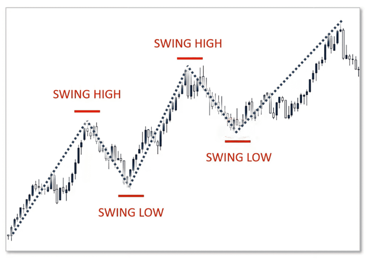
To clarify, bullish trends consist of a series of higher swing lows and higher swing highs and bearish trends are made up of a series of lower swing lows and lower swing highs.
Looking at the chart above, you can see that the first pullback in this bull trend finds a bottom and then rallies higher, that’s a swing low. Then it makes a new swing high, pulls back a little bit, and then it makes another swing low. Very straightforward. Just a little bit more nuance to understanding trends.
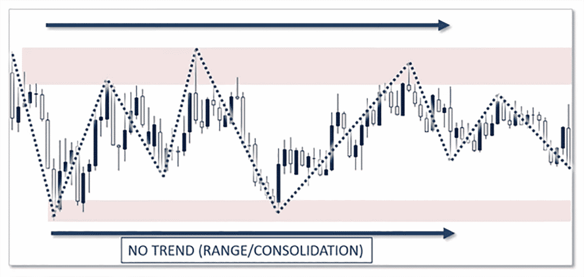
Ok, so now that we’ve talked about uptrends, downtrends, and swing points, let’s go back to ranges now. A range, as I mentioned, when price moves in a sideways direction, we call that a range because the price is between a high and a low, i.e. between two prices.
In ranges, nobody really is in control of the market between the bulls and the bears. In ranges, price just moves sideways for a period of time, and eventually it’ll break out of that range either to the upside or to the downside.
Another key aspect of technical analysis and reading candlestick charts is to understand the concept called support and resistance zones. Support zones if you think about it, like when you stand on something, it’s offering support.
A support zone in a stock is when the instrument you’re trading is supported at a particular price or zone, where buyers feel like, “Hey, it’s really cheap at this level. We’re going to keep buying anytime it gets down, and we’re going to buy it and then we’re going to send it back up”. That is a support zone.
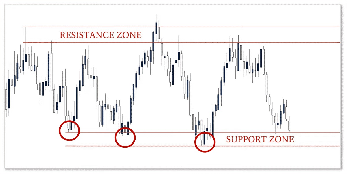
It’s when bulls feel the stock is cheap, they feel it’s a good value, they’re going to continue to buy it because they feel it’s valuable at that particular price. Hence, the instrument is supported by this.
A resistance zone is just the opposite. It’s a ceiling that is hard for the stock to break through in price. This could be because the buyers simply don’t want to buy it at this price as they feel it’s too expensive and sellers feel that “Hey, we feel this stock is expensive at this price, we are going to sell this stock, and therefore provide a temporary ceiling for this stock in terms of price.” These are support and resistance zones. Very straightforward.

You need to think of them like the floor and ceiling in your house. They provide support or resistance for things to be supported on the downside or capped in terms of how much they can grow to the upside & they only last for a period of time.
There is a lot more to learn about technical analysis and this is just to give you the basics. But for now, if you’re a beginner, you should have a basic foundation in candlestick charts and technical analysis.
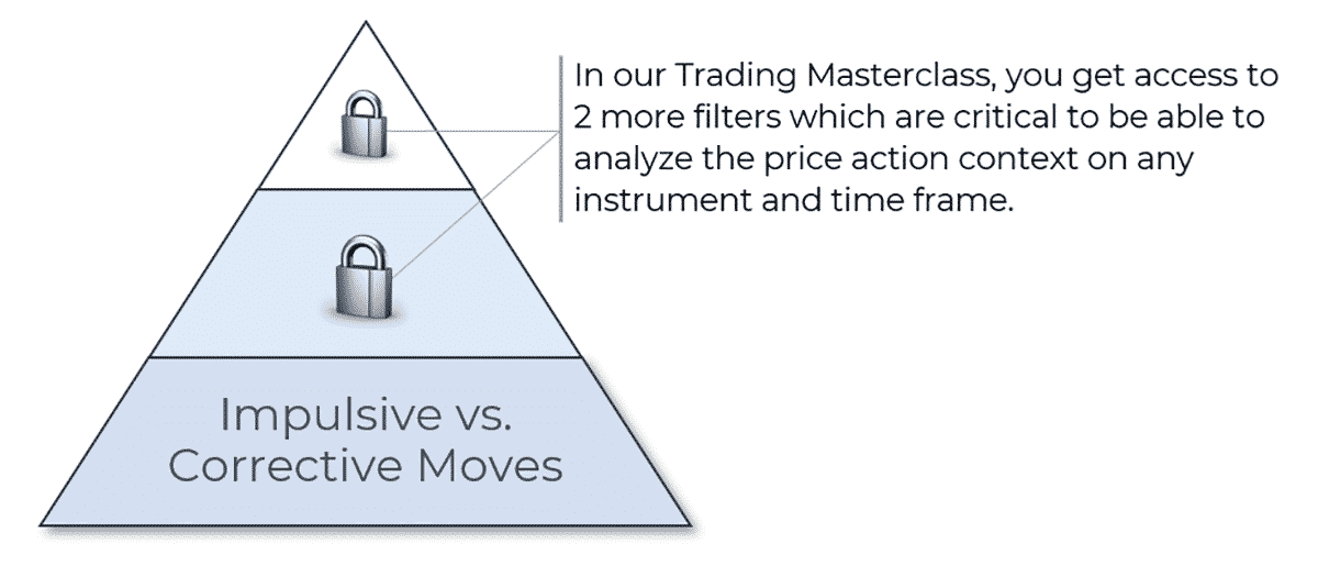
Price Action Pyramid
If I had to look at price action as a structure, it would be a pyramid, with the base being how price action is a reflection of order flow (particularly executed transactions).
In our Trading Masterclass, we have 3 major filters to understand price action context and in this article, we’ll talk about 1 of these 3 filters which are impulsive and corrective moves.
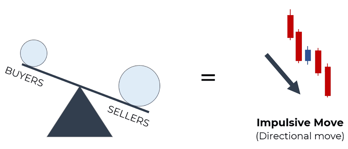
Impulsive Moves
During impulsive moves, the order flow is relatively ‘imbalanced’, meaning it’s dominant towards one side (buying/selling) which causes strong directional moves.
3 characteristics of impulsive moves are:
- Larger candles
- Majority of candles are of the same color
- Candles often close towards the direction of the move
Below is an example of impulsive moves:
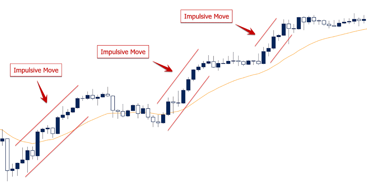
Impulsive moves are critical to understanding price action context because they communicate a strong ‘imbalance’ in the order flow of the market. The more ‘imbalanced’ the order flow is to one side, the stronger the directional move will likely be.
Impulsive moves communicate critical things to you about your current/potential trades, such as:
- Who’s in control of the market (bulls/bears)
- If a move/trend is more likely to continue
- If there is a potential breakout
By learning about impulsive moves, you can make critical trading decisions to increase your potential profit.
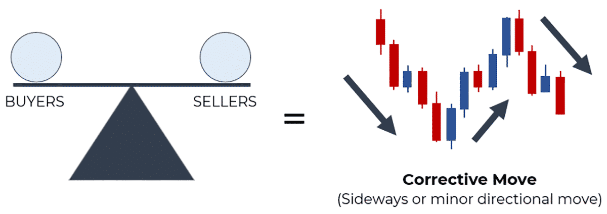
Corrective Moves
Corrective moves are also critical to understanding price action context because they communicate a relative ‘balance’ in the order flow.
3 characteristics of impulsive moves are:
- Smaller candles
- Candles close towards the middle
- Greater mix of bullish/bearish candles (mixed color)
If there is a relatively even number of buyers and sellers (buying/selling in relative equal amounts), the price action and market won’t move much up or down.
For a directional move to happen in the markets, an ‘imbalance’ between the buyers and sellers is required.
Below is an example of impulsive moves:
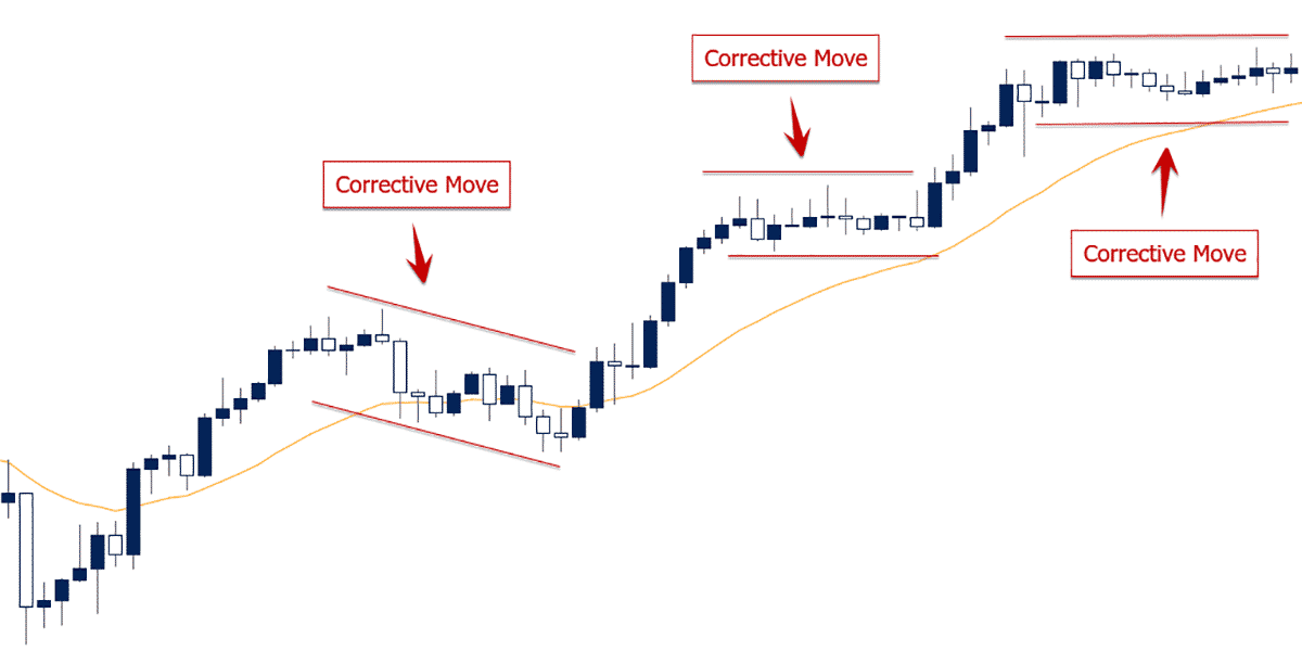
You should be able to notice that the chart above is the same chart in which we marked the impulsive moves earlier. This is a great example of how bullish impulsive moves, followed by corrective moves create a directional movement, i.e. bullish trend.
Corrective moves give you important information about your trades and price action, such as:
- When the market is taking a pause (likely to range)
- When it is more conducive to play both sides of the market
- When you need to be more patient with your trades
- Potential trade locations
Learning how to spot and read corrective moves, enables you to optimize your trading decisions and increase your potential profit.
Using Impulsive and Corrective Moves to Discover the Price Action Context
Now that we understand the basics of impulsive and corrective moves, we can use them to discover the price action context of the market.
As a general rule, an impulsive move (the majority of the time), is followed by a corrective move. For example, a with-trend impulsive move, followed by a corrective move, is more likely to be followed by another with-trend impulsive move than the opposite (counter-trend).
Now, what do impulsive and corrective moves teach us about price action context?
They give us an underlying sense of what the dominant order flow is.
If you see a potential trend in place, along with a good series of impulsive and corrective moves, then you can feel confident the order flow is imbalanced towards the bullish side (bullish PA context), and thus you should be looking to buy more often than sell.
Want To Learn More About Price Action Context?
While impulsive and corrective moves are a crucial part to determining price action context, they are only one tool in the took-kit our students use to achieve this.
We have two other key factors to determine price action context and in which direction the dominant order flow in the market is imbalanced towards.
To learn more about these two, plus much more, like reversal patterns and ways to increase the accuracy of your entry locations, check out our Trading Masterclass where we teach you how to analyze higher-, lower- and multiple time frame contexts with clear rules to understand them.
In fact, our entire 1st section of lessons is dedicated specifically towards understanding price action context. Inside the course, you’ll also learn how to read other critical (and more advanced) price action structures to help you find high probability trade setups.
If you’re currently learning/trading a price action strategy or approach that only works on specific time frames or instruments, then it’s a limited strategy that doesn’t really understand how price action or price action context works
If you want to learn how to read the markets in real time instead, find more and better trade opportunities, increase your profit potential and at the same time boost the quality of your learning process, make sure to check out our Trading Masterclass.